About me
To be filled in later.
Mark And Max braindump notes
It started when Max posted his concerns on this blog post which sparked me to make up better ways, mock them up in images and show them to Max. That resulted in a face to face meeting. One of the things we discussed where possible improvements for fedoraproject.org then mainly the get-fedora page. We both agreed that the current way wasn't really user friendly for beginning fedora users and could be a lot more attractive for them. We discussed the mockups i created for the main and get-fedora page and he agreed on both to be more user friendly then the current way. All that had to be done was refine the ideas, get the guess work (if any) out as much as possible and make a proposal in the fedora websites list. That refining is right now and me being a fas member now is part of that.
Max and i also looked at some other distributions to see how they handle downloads. We looked at (as far as i remember): Fedora, OpenSuse, Mandriva and Ubuntu. Here are the conclusions that i still remember.
But first a list of assumptions!
- On the sites of the distributions below we only looked at how easy it was to get to the download page
- and how good (or bad) does that look compared to fedora
- and how obvious a link to the download page was
- The idea was: how would new users, any new users experience the road to the fedora download page
- that includes complete pc n00bs
- and highly advanced pc users
Fedora
On the fedora main page: no clear direct place to download it. Even better not a single "download" on the page. At first sight not obvious at all where you need to click. If you click on the big fedora "banner" you are linked to the tour page. Every single link outside the menu brings you to some place else then the download place! The only places where you can click to download it is: the small banner on the top left with the lion in it or the relatively tiny "Get Fedora" link in the menu. This is not obvious and requires the user to just look around first. Might be a good marketing trick but to me personally it's just annoying.
OpenSuse
"Get It".. and then? then you get a range of radio buttons. Ah no, i have to make choices! Avoid that at default and provide an advanced option with those choices.
Mandriva
At first sight not clear where the download button is (http://www2.mandriva.com/) but when you click that (top center) then you get a very fancy looking download page. It looks clean and to the point. Max said: "We should have something like that or better.".
Ubuntu
You can't miss the download there! it's right in the header and not something you miss. We both saw this as a very clear and fast way to download it but is it nice? We didn't think so.
Our conclusion
We both liked the download page of mandriva a lot and thought that fedora should have something like that as well. Or with that kind of simplicity. actual quote of max if i remember right: "Why didn't we think of that".
Mockups for a improved fedora
Get Fedora
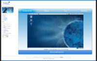
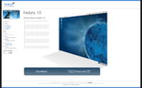
This is a mockup of the Get Fedora page. This is just to show how it could be done. The colors are way out of the fedora range but it does show the simplicity for new users.
Main fedora page
This is a mockup of the FedoraProject.org homepage. This is just to show how it could be done. The colors are way out of the fedora range but it does show the simplicity for new users.
Other possible improvements for fpo as mockups
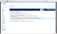
This is something i noticed when i needed to sign up for the web group. It's not said on that page anywhere! Perhaps not needed? just what i noticed.


