< Anaconda | UX Redesign
Ctbeiser's Ransom Note Sketches
Iteration 1
In this iteration, a grid system has been applied, ideas have been refined, gradients have been replaced with patterns (partially so they can flow to fill an area if needed, but also because it looks nicer) and the typeface has been changed from Cantarell to Comfortaa. All are licensed under CC-BY 3.0
This one has the potential risk of being hard to translate while keeping the dynamicness of the text alive.

The text is inverted with a mask, so it can be altered without significant effort.
The fake leather is possibly not the best choice for avoiding controversy (See:iCal), but it fits well with conceptions of business and work while not making the grid system look like a total mess. It's worth noting that this design does violate LibreOffice's brand guidelines, in that the proper space above and below the logo is not allowed, but I can't think of a good solution, and it does look nice.
I think this wordplay should be translatable, but I'm not entirely sure.
Earlier drafts of this had 'most' before the media-players, but I've removed it for better spacing and succinctness.
A zip of the source PSDs: Media:RansomIteration1.zip
First drafts
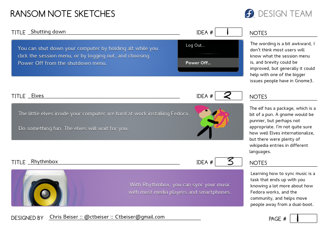
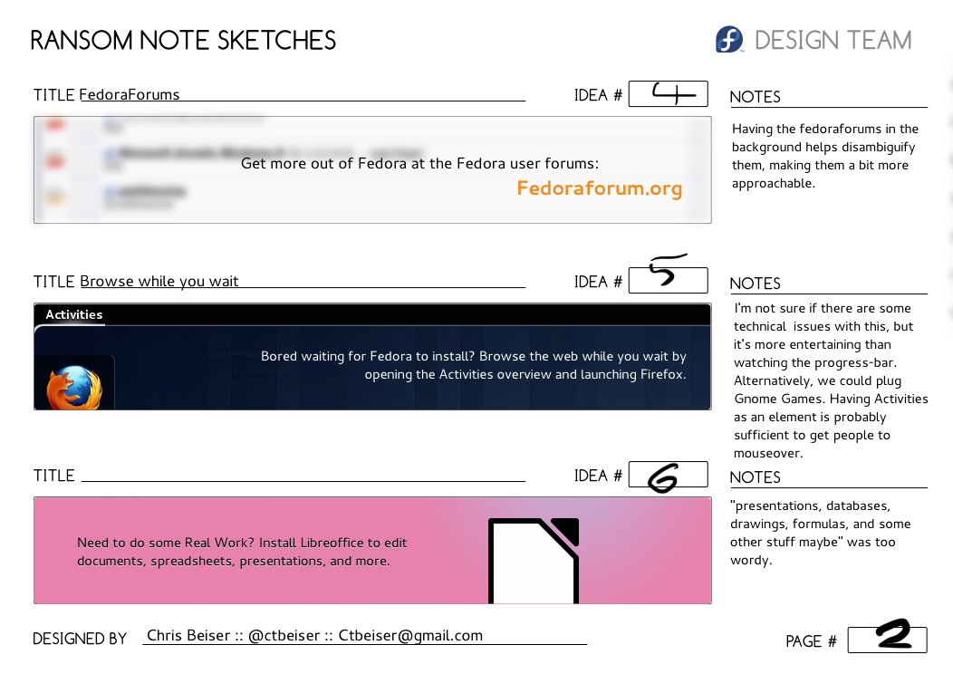
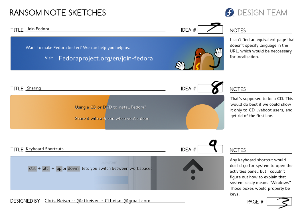
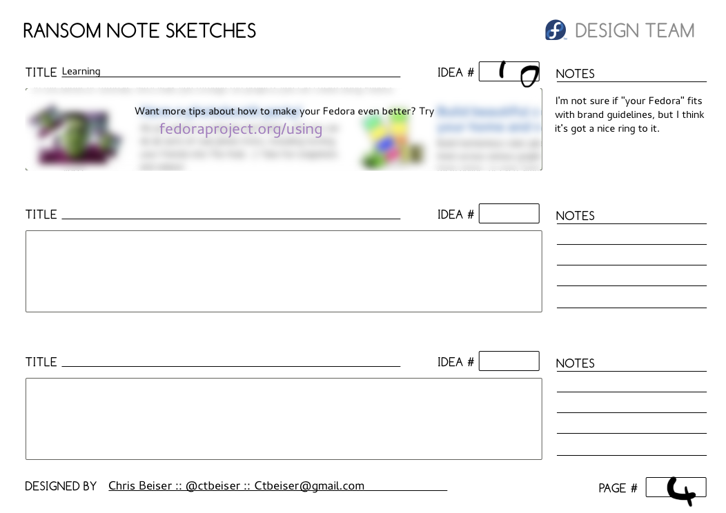
Some of these may appear a bit overly polished, but it's mostly just gradients picked from the fedora colors and screenshots dropped in, with all the type in Cantarell. There's only one sketch per concept, but the content seems to be the important thing; other representations should come naturally.
It turns out that due to the diversity of Fedora installs, Gnome-specific ones aren't going to be possible.


