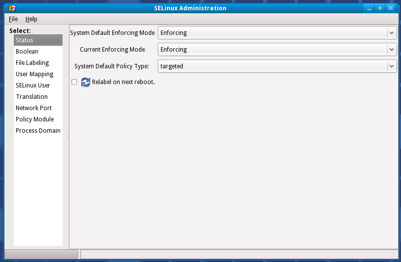
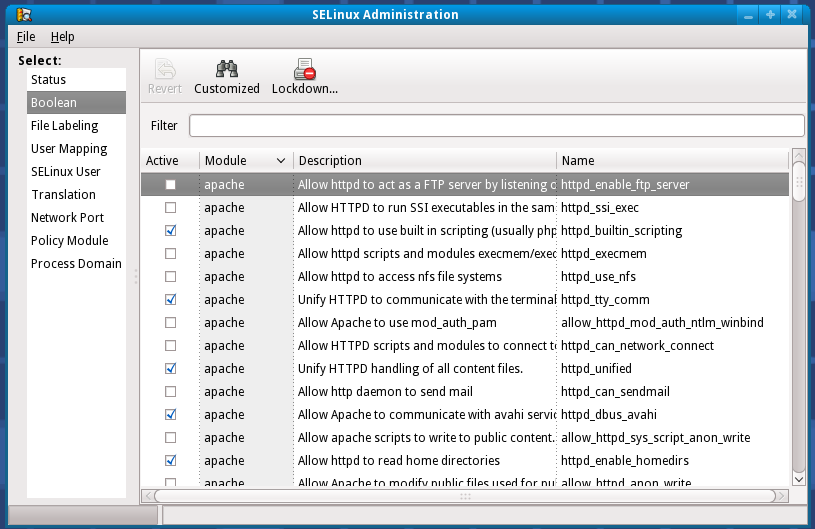
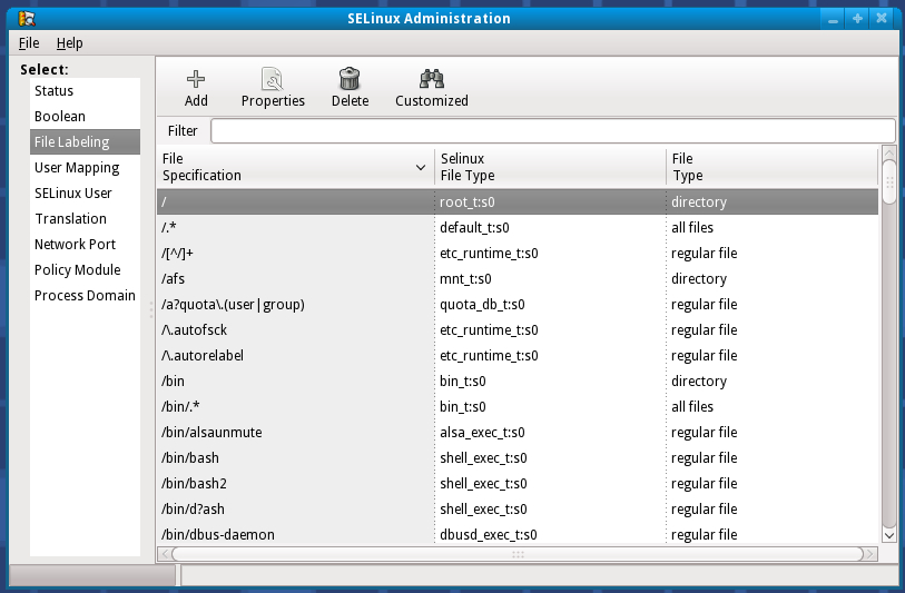
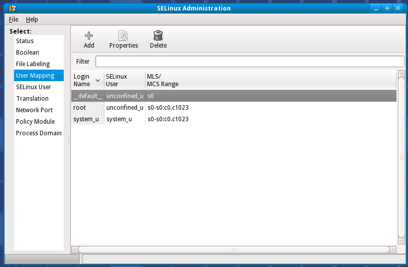
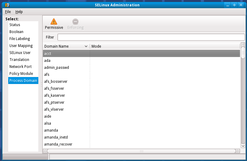
Current UI
Flat navigation between the following tabs:
- Status
- Boolean
- File Labeling
- User Mapping
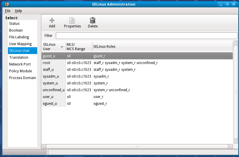
- SELinux User
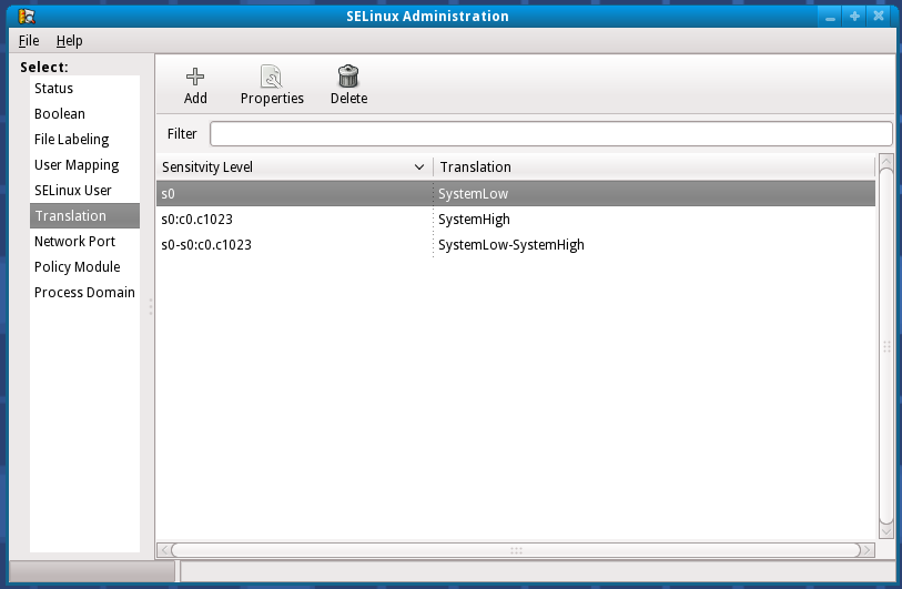
- Translation
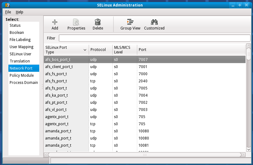
- Network Port
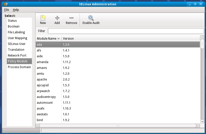
- Policy Module
- Process Domain
Screenshots
Status
Boolean
File Labeling
User Mapping
SELinux User
Translation
Network Port
Policy Module
Process Domain
Mockup Proposal 1
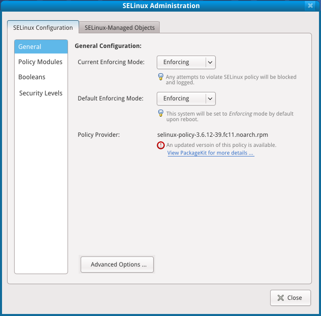
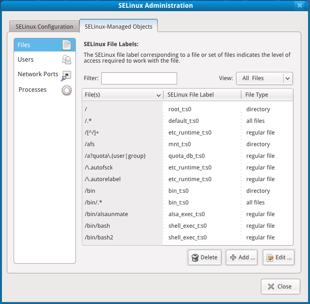
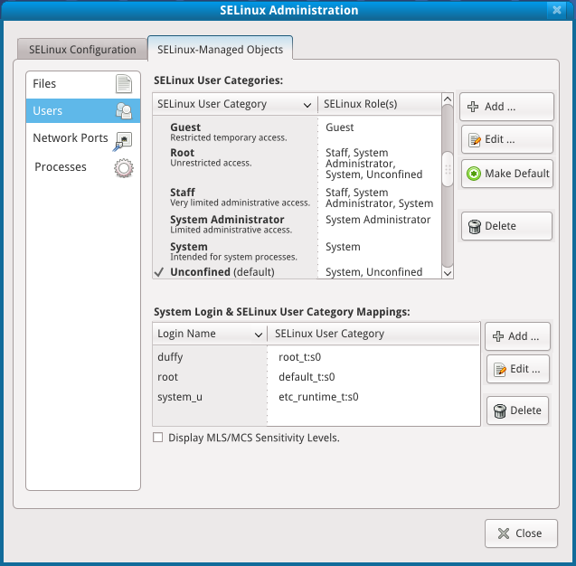
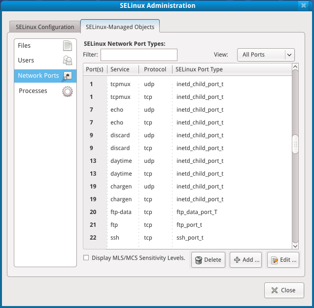
Gist of the changes - split the tabs into two main sections - SELinux configuration, and SELinux managed objects:
- SELinux Configuration:
- current enforcing mode / default enforcing mode / policy provider / current policy (advanced)
- policy modules
- booleans
- security levels
- SELinux Managed Objects:
- files
- users (integration of selinux users & user mappings)
- network ports
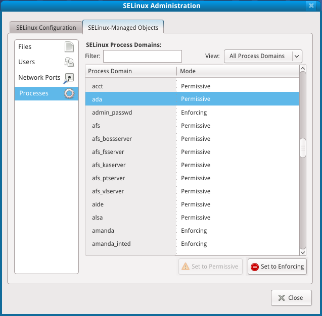
- processes
Mockup source: Media:sysconfig-selinux-mocks1_source.svg
SELinux Configuration
General
Policy Modules
File:Sysconfig-selinux-policymods.png (in progress)
Booleans
File:Sysconfig-selinux-bools.png (in progress)
Security Levels
File:Sysconfig-selinux-seclevels.png (in progress)
SELinux Managed Objects
Files
Users
Network Ports
Processes
Issues:
- It's not actually displaying all process domains but a rough guess at them.
- Domains which are defined as permissive in a policy module not name <domain>_Permissive will be displayed as enforcing.
The idea of permissive domains is to turn SELinux off for some things but not everything.
Mockup Proposal 2
Keep the tabs flat as they are today, integrating the two user-related tabs, but make the tabs go straight across.


